
 previous


Copyright © 2026 disco. All rights reserved.
We Idliwale Barroom - Story
Logo design & Branding
We Idliwale started as a QSR (Quick Service Restaurant) in Pune, offering traditional South
Indian
cuisine with innovative twists. Known for its "honest yet hatke" dishes like Idli Chicken,
Mutton
Kari Dosa, and Japanese Kare Pan, it has won the hearts of its patrons. Since then, We Idliwale
has
opened more outlets in Pune.
We Idliwale Barroom
We Idliwale took another leap and started the next big thing: We Idliwale Barroom, a restaurant
bar
where you can enjoy its trademark dishes with your favourite drinks.
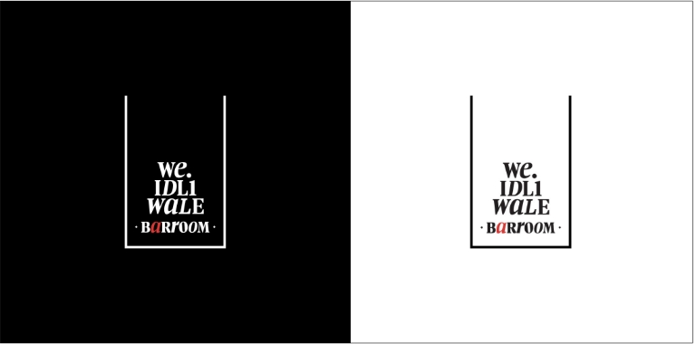
Logo & Identity
In the initial stages of creating the Barroom logo, we explored various shapes and concepts,
experimenting with different design ideas. While the brand's philosophy and visual language were
already established, our task was to carry this language forward, infusing it with a fresh twist
to
connect it seamlessly to the new business. The turning point came when we examined a glass's
simple
yet iconic shape. It was here that everything started to click, guiding us toward the final
design.
The shape captured the essence of the Barroom, effortlessly aligning with the brand’s
ethos.
We strategically introduced red into the colour palette to distinguish We Idliwale Barroom from
the
already-established We Idliwale. This bold addition ensured each brand retained its unique
appeal
while staying true to its core identity.
Logo
Devanagari

For the Devanagari typeface, we utilised the brand's English font family and skillfully transformed it into Devanagari to maintain continuity across both languages. This further cements the Barroom's connection to its roots while giving it a contemporary edge.
Signage

Social media
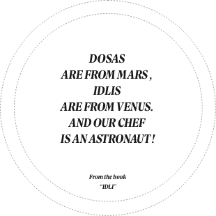
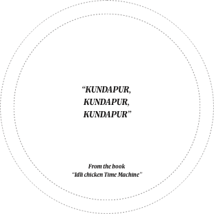
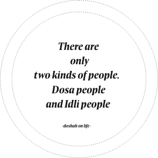
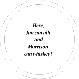
Coasters

Website
Onam stamps
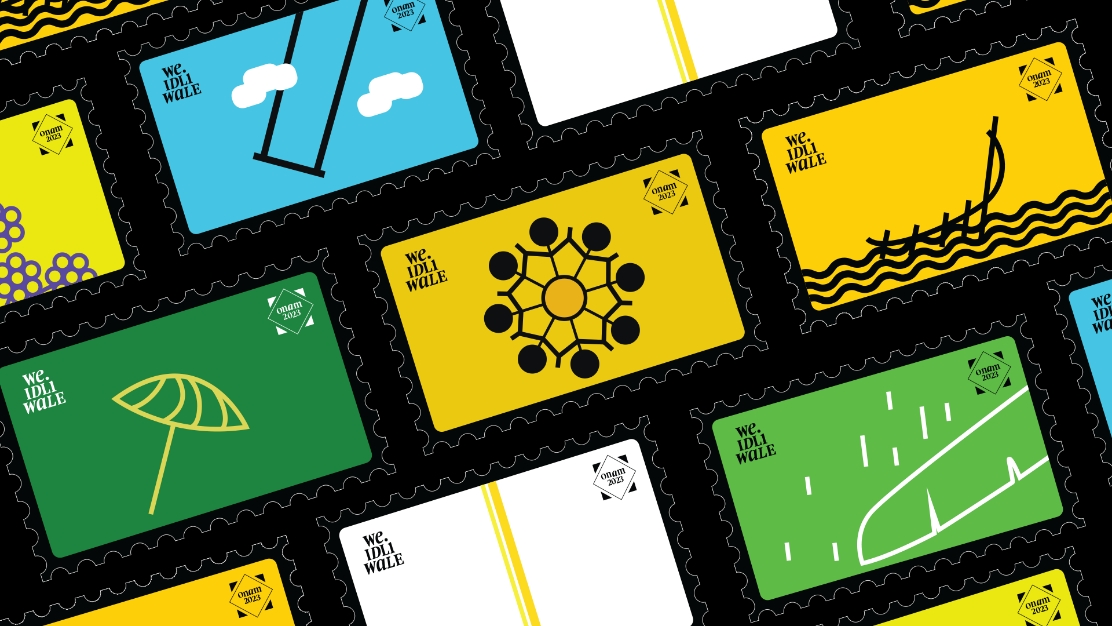
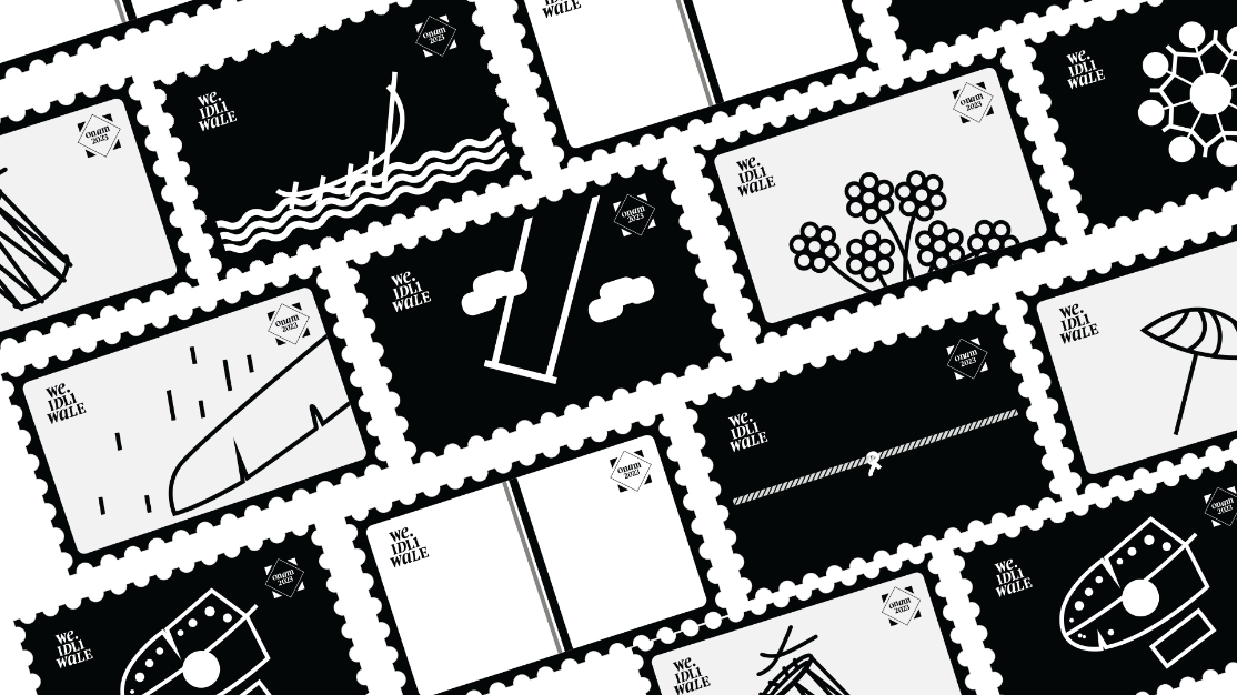
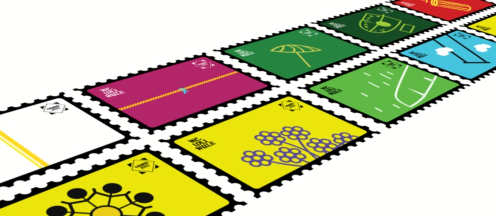
The Onam stamps for We Idliwale are a fun, minimalistic take on Kerala’s vibrant cultural heritage. Each stamp highlights something special about the festival—whether it’s the excitement of boat races, the rhythm of traditional music, or the beauty of floral patterns, these designs capture the essence of Onam in a simple yet meaningful way.