
 previous


Copyright © 2026 disco. All rights reserved.
xts - Story
Branding
XTS Logo Identity, Branding, and Office Campaign
XTS approached us with the challenge of creating a logo that reflects its dynamic spirit of growth and
innovation.
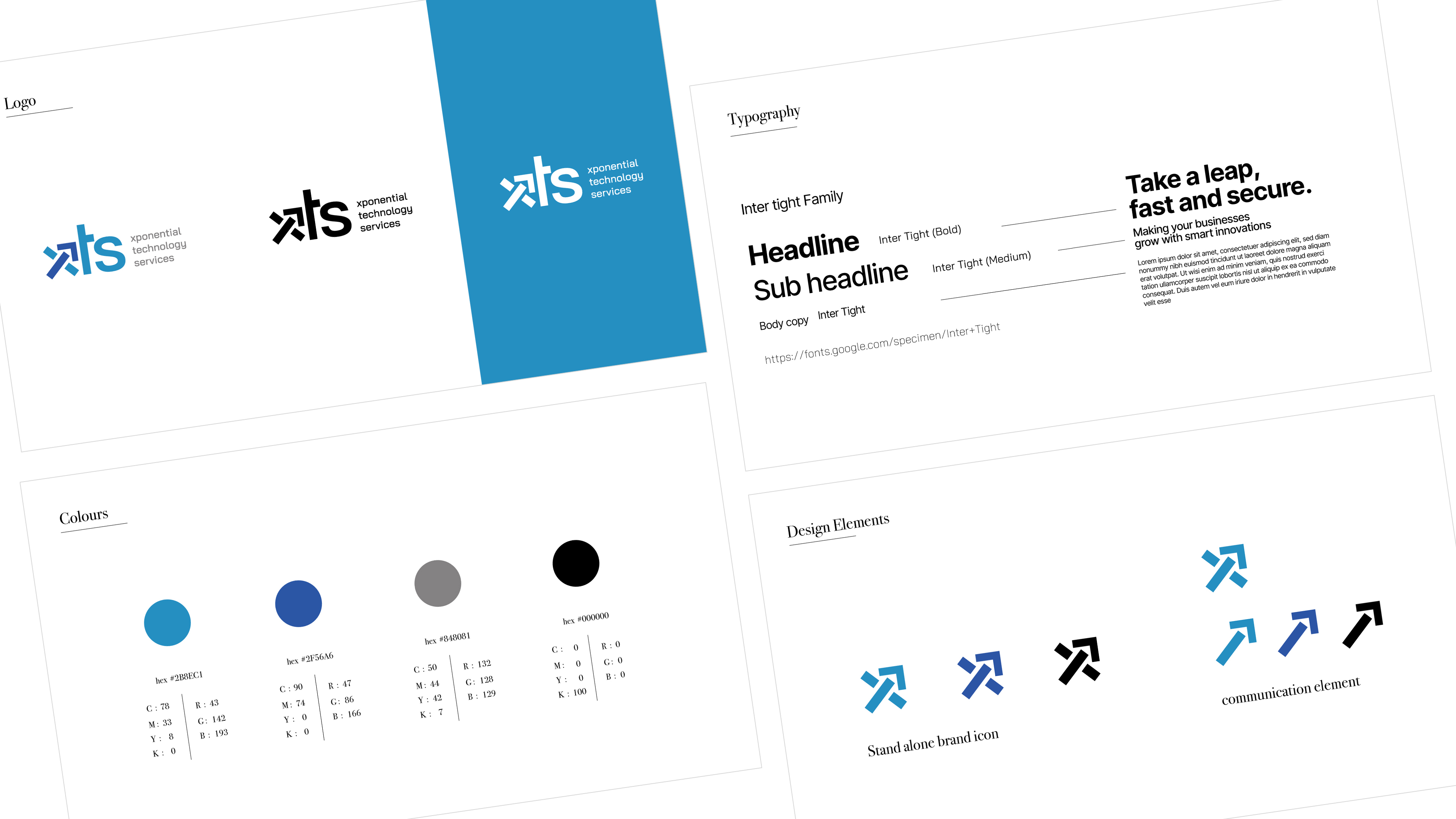
We began with a clean, sans-serif typeface to convey professionalism and confidence. The bold letterforms
express stability, while the arrow within the ‘X’ signifies acceleration and forward momentum. The
intersecting lines reflect the convergence of technology and innovation, and the vibrant blue palette
reinforces trust and reliability.
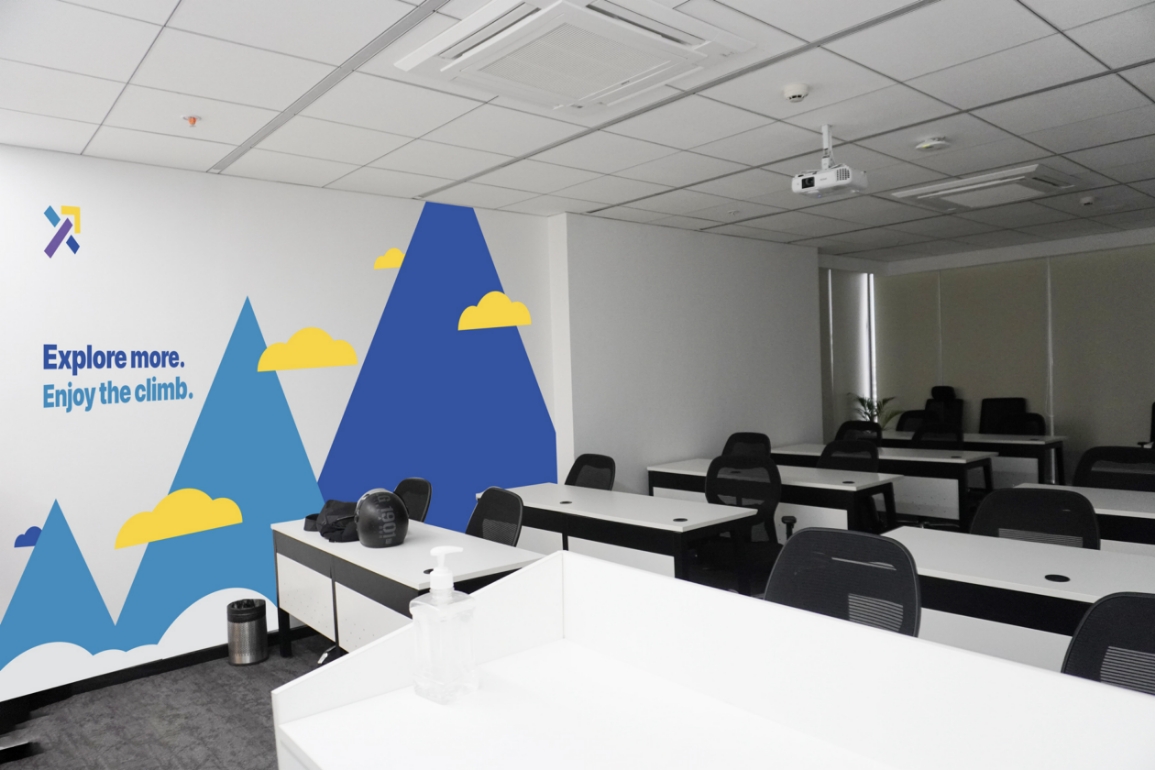
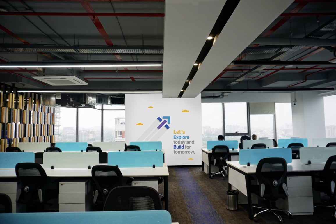
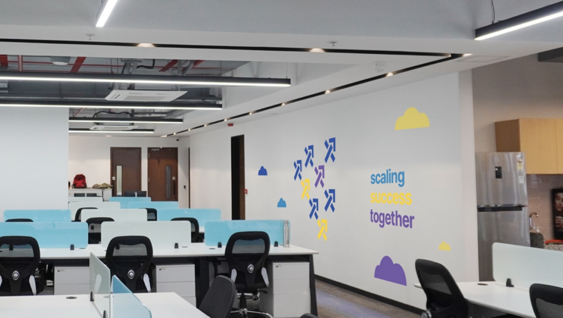
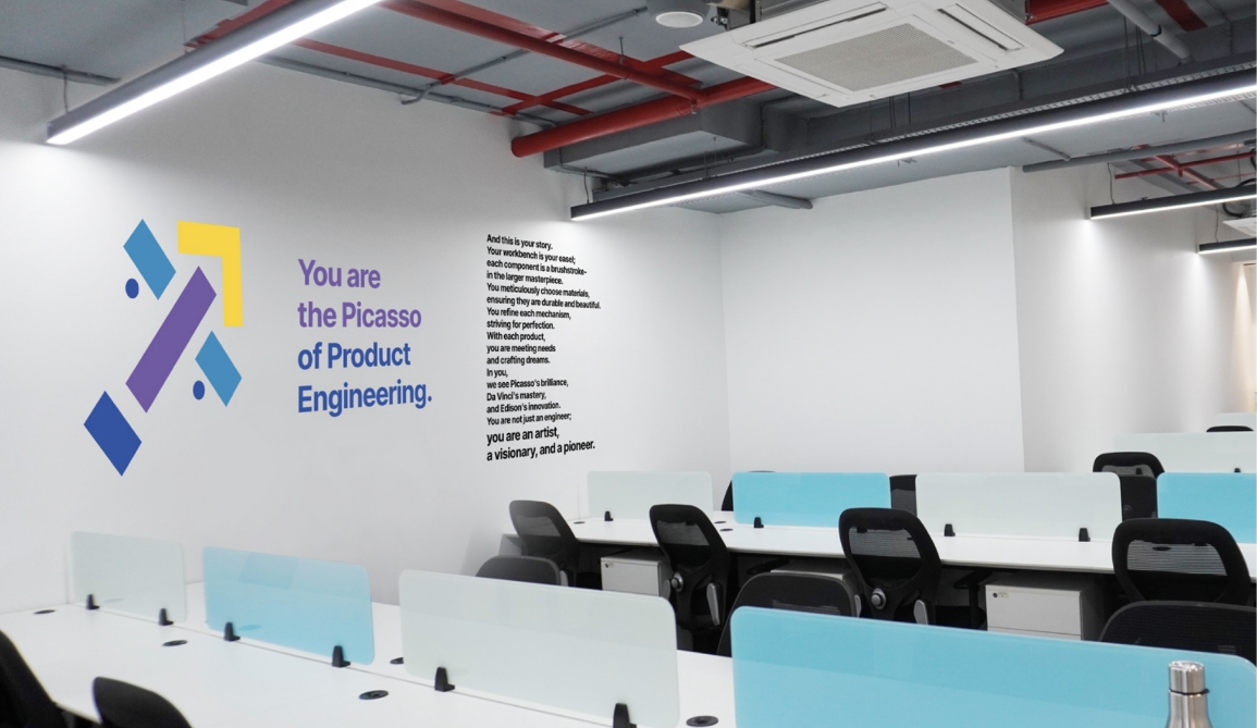
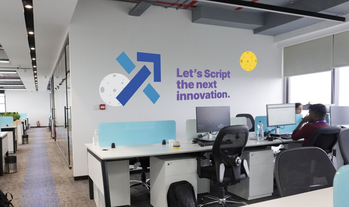
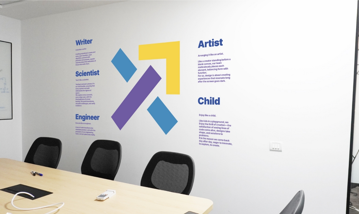
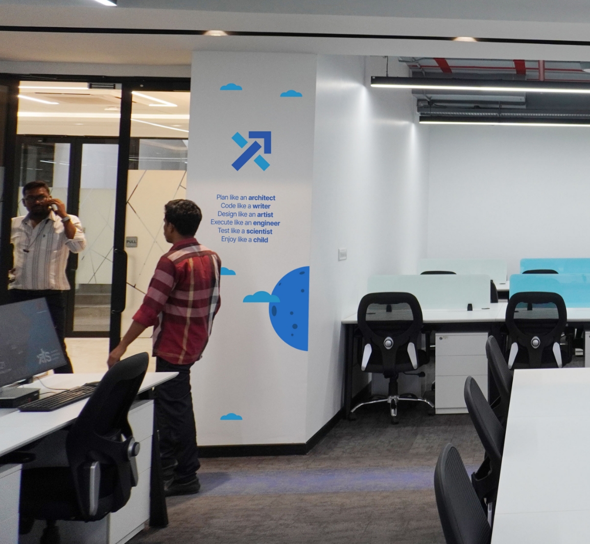
Alongside the logo, we developed a spatial branding campaign for the XTS office. By drawing inspiration
from art, science, and sports, the design fosters a culture of curiosity, playfulness, and innovation
among XTS employees.
Logo

Symbol




Spatial design